



Truck advertising ideas that generate real phone calls are not complicated, but they are rare. Most work trucks on metro Detroit’s roads are either completely blank or covered in so much information that the phone number gets lost between the service list, the license number, the tagline, and three different logos. Neither approach generates calls. This guide covers what to put on your truck, where to put it, and how to design it so someone reading your rig at a stoplight on Gratiot Avenue can find and remember your number before the light changes.
Why Most Truck Graphics Fail to Generate Calls
A commercial vehicle has between three and five seconds of attention from anyone who sees it at a stoplight, passes it on the highway, or notices it parked at a job site. That is not much time. In those three to five seconds, the reader can absorb exactly one thing well, two things with effort, and three or more things not at all. Most wrapped trucks present four to eight pieces of information simultaneously: company name, logo, tagline, service list, phone number, website, social media handles, and license number, and expect the reader to organize it themselves. They don’t. They move on.
The second failure is phone number sizing. The phone number is the single action item on the vehicle; it is the thing that converts a reader into a caller. Yet on most commercial vehicles, the phone number is smaller than the company name, smaller than the tagline, and smaller than the service list. This is backwards. The phone number should be the largest readable element on the truck after the company name.
The Three-Tier Message Hierarchy for Truck Graphics
Tier 1: What You See From 30 Feet or a Moving Car
Tier 1 is the message that registers from a moving car, from across a parking lot, or from a window at the job site. It has two elements: your company name and a one-line service descriptor. The company name needs to be in a font weight heavy enough to read against whatever color is behind it, at a size that spans most of the available panel width. The service descriptor is four to five words maximum: “HVAC · Plumbing · Electrical” or “Residential Roofing · Metro Detroit” or “Commercial Painting · Licensed · Insured.” That is all that needs to be in Tier 1. Everything else belongs in Tier 2 or 3.
Tier 2: What You See at a Stoplight or in a Parking Lot
Tier 2 is what someone reads when they have five to fifteen seconds and are within 15 to 20 feet of the vehicle. This is where your phone number lives, and the phone number should be the largest element in Tier 2 by a significant margin, minimum 4 inches tall on a full-size van or pickup in a bold weight. Below or beside the phone number: your website URL at a slightly smaller size. Optionally: your service area (“Serving Metro Detroit, Oakland, Wayne, Macomb Counties”). Nothing else.
The phone number placement that generates the most calls is the rear of the vehicle. The rear panel is what drivers see at stoplights for 60 to 90 seconds, more time than any other viewing context. A phone number at 5 to 6 inches tall on the rear doors is the single highest-return allocation of truck graphic real estate available.
Tier 3: What You See Standing Next to the Truck
Tier 3 is for people who are already engaged, a potential customer walking up to the truck at a job site, someone who has stopped specifically to get the information. This is where secondary services, license numbers, and credential information belong. A master electrician’s license number, a contractor registration number, an “A+ BBB Rated” badge- these all live in Tier 3, small enough that they don’t crowd the Tier 1 and Tier 2 messages but present for anyone who wants them.
Phone Number Size and Placement: The Most Important Decision
The most commonly under-sized element on commercial vehicles in metro Detroit is the phone number. The practical minimum for readability from a car at a stoplight is 4 inches tall. The practical target for maximum legibility at distance is 5 to 6 inches tall. The font weight must be bold or extra-bold; thin or medium weight numerals at even 5 inches tall are harder to read than bold numerals at 4 inches. High contrast is essential: white numerals on a dark background, or black on white, outperform any other color combination.
Place the phone number on three surfaces in priority order: rear doors or rear panel first (maximum stoplight exposure), driver side second (left-side approach, most frequent for residential service calls), passenger side third. If budget requires choosing only two surfaces for the phone number, rear and driver side are the correct choice.
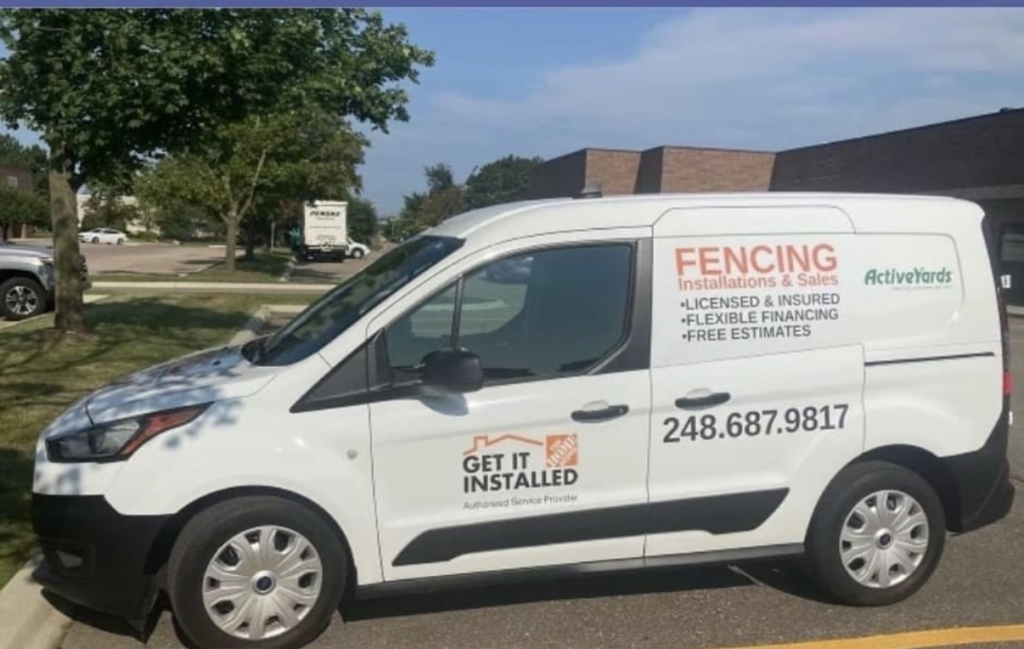
Full Wrap vs. Partial Wrap vs. Lettering-Only for Work Trucks
A full wrap on a white van sends a different message than lettering on a white van, independent of the design content. A fully wrapped vehicle reads as a company that has made a meaningful investment in its brand, which signals to potential customers that the business is established and cares about its image. Lettering-only on a white van reads as a smaller, perhaps newer operation. Neither is wrong, but they create different perceptions that affect whether a prospect picks up the phone.
For trades and service businesses in metro Detroit, the partial wrap is often the right compromise: full wrap the rear panel and both door panels (the highest-visibility surfaces), leave the hood and cab in the base vehicle color. This approach captures 70 to 80 percent of the visual impact of a full wrap at 50 to 60 percent of the cost. The rear-panel-and-doors partial wrap is the most common vehicle wrap format for single-operator trades businesses in the Detroit market.
Color Strategy for Truck Graphics
Color strategy on commercial vehicles comes down to one decision: does the design provide enough contrast to read clearly on the base vehicle color? White vehicles, which make up the majority of commercial van and pickup truck fleets, allow the widest range of design approaches. Dark blue on white, black on white, and dark green on white all provide strong contrast and read well at distance. Red on white reads well but is heavily used and creates less differentiation on metro Detroit roads where red-on-white service vehicles are common.
For non-white base vehicles, the design challenge increases. A red truck with red branding elements creates no contrast and is essentially invisible as a branded vehicle. A blue truck with white graphics is cleaner. If the fleet includes vehicles in multiple colors, a full wrap brings every vehicle to a consistent base color, which is one of the strongest arguments for full wraps on mixed-color commercial fleets.
Industry-Specific Design Considerations
HVAC, Plumbing, and Electrical Contractors
For trades businesses, the service descriptor in Tier 1 is the most critical element after the phone number. A customer who sees a truck with “HVAC Service” at a job site in their neighborhood and needs a furnace repair is going to look for that number immediately. The service must be legible from the road, not listed in small text as one item among eight. Pick the primary service category and make it Tier 1. Secondary services belong in Tier 3.
Construction and Landscaping
Work trucks in construction and landscaping take more physical abuse than service vans: gravel impacts, equipment contact, pressure washing, and exposure to job site chemicals. Material specification matters here: cast vinyl with a high-quality laminate is the minimum standard for Michigan work trucks. Calendered vinyl without a laminate will fail within two years under heavy-use conditions. The laminate also provides UV protection that maintains color vibrancy through Michigan summers.
Design Mistakes That Kill Response Rates
| Mistake | Why It Kills Response |
|---|---|
| Phone number too small | Can’t be read from a moving car. The reader has moved on before they can get it |
| Too many services listed | Creates visual noise; the reader can’t identify what’s relevant fast enough |
| Thin font weights | Light letterforms lose contrast at distance, especially against complex backgrounds |
| Centered layout on side panels | Curves on vans and trucks distort centered designs. They read as misaligned at distance |
| QR codes on vehicle sides | No one scans a QR code on a moving or parked vehicle; it takes the space the phone number needs. |
| Decorative display fonts | Trade-style display fonts reduce legibility at speed; bold sans-serif always outperforms |
| Multiple competing logos | Industry certification logos, awards, and association badges in Tier 1 position compete with the primary message |
Getting Truck Graphics Produced in Detroit
Detroit Signs & Graphics produces vehicle graphics for trades businesses, service fleets, and commercial operators across metro Detroit. The process starts with a design brief, your brand colors if you have them, your company name, phone number, website, and the primary service you want in Tier 1. From there, we produce a design proof on an accurate vehicle template and move to production on approval. Most truck graphics projects run two to three weeks from brief to installation.
Frequently Asked Questions
What information should I put on a work truck wrap?
The essential information for a work truck wrap is: company name (Tier 1), primary service category in four to five words (Tier 1), phone number at large size (Tier 2), and website URL (Tier 2). Everything else, including social handles, secondary services, license numbers, and awards, belongs in Tier 3 at a smaller size that doesn’t compete with the primary message. The phone number should be the largest single element after the company name.
How big should my phone number be on a truck wrap?
Minimum 4 inches tall in a bold or extra-bold weight for readability from a car at a stoplight. The target for maximum impact is 5 to 6 inches on a full-size van rear panel. The phone number on the rear of the vehicle, where it is visible to following drivers for the entire duration of a stoplight, is the most valuable piece of advertising real estate on the vehicle. Do not under-size it.
What type of vinyl is best for work trucks in Michigan?
Cast vinyl with a quality overlaminate is the correct specification for Michigan work trucks. Cast vinyl conforms to vehicle panel curves and riveted surfaces better than calendered vinyl and resists the shrinkage that Michigan’s temperature cycling causes. The overlaminate adds UV protection and surface durability for vehicles that are pressure-washed frequently, exposed to road salt in winter, and subject to the physical wear of daily commercial use.
How long does a truck graphic last in Michigan winters?
Cast vinyl with a quality laminate installed on properly prepared paint by an experienced shop should last four to six years on a work truck in Michigan conditions, with regular rinsing during salt season. Calendered vinyl without laminate often shows edge lifting and color fading within two to three years under heavy-use Michigan conditions. For more detail on Michigan vehicle wrap lifespan and maintenance, see the full guide on car wrap longevity.
Should I get a full wrap or just lettering on my work truck?
If budget is the primary constraint and the vehicle is white, a partial wrap covering the rear panel and door panels gives you 70 to 80 percent of the full wrap’s visual impact at 50 to 60 percent of the cost. If the vehicle is a non-white color that conflicts with your brand, a full wrap is usually required for brand accuracy. For a single owner-operator starting, lettering with a large phone number on the rear doors is more effective than an expensive full wrap with a cluttered design.